After reviewing over 100 UX/UI online portfolios, there are 3 items that are often missing from a UX/UI online portfolio. Actually, there are 4! But the fourth one requires an article of it’s own. (on Medium)
Including these 3 items strengthens your UX/UI online portfolio and makes your portfolio more impactful to recruiters and hiring managers.
Why these 3 items are important in your online portfolio
Recruiters and hiring managers are busy people. You want to share your projects so they can be scanned and reviewed quickly.
Recruiters and hiring managers want to understand your design process. How do you handle user feedback? How does it affect your designs?
And, they want to know what you learned. How are you growing as a designer?
1. Hero Image with Project Name and Brief Description
An image of your finished design at the top of our project goes a long way toward helping the recruiter and hiring manager understand the project.
But not only an image, include the name of the project, along with a brief description.
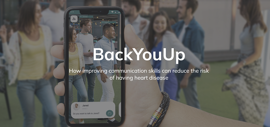
Iuliia Vasiukova does this well:

Immediately, the recruiter or hiring manager knows the name of the project and the problem it solved. Plus, they get a flavor of her design work.

Amy Lima includes all the elements: name of project, project description and image of the final design. (Note: you can scroll down more on her site to see the rest of the image) However, they are all separate. I recommend combining all that info into one hero image. Again, this gives the recruiter or hiring manager a quick glance without having to scroll to know immediately the name of the project, what the project is about, and a feel for Amy’s design work.

Nael Mahouton does this well, too. Again, like we saw with Amy, he doesn’t combine these elements into one hero image. I think in this case it works because it still all shows up immediately at the top without having to scroll down.
2. Before and After Images
Too many online portfolios mention using the feedback from user testing to make changes to their design, but they never show the changes. It may be that they didn’t capture the iterations of their design. That’s too bad, because it is those interactions that attract the attention of a recruiter or hiring manager. They want to see how you respond to feedback and how you apply feedback to your design process. Don’t forget to take screenshots of your in-between designs.

Iuliia does this well throughout her portfolio. She explains what was revealed during the usability testing (along with an image of the design), and how that changed the design. The before and after images make it quickly discernible for a busy hiring manager or recruiter to understand how she adjusted her designs based on feedback.
To improve this particular example, I suggest adding text on the images explaining the difference. She explains it well in the paragraphs to the left of the images, but adding a very short text explanation on the image makes it even a quicker read.

This is another example from Iuliia’s portfolio. What really stands out in this example is what is often missing in online portfolios — she includes the ‘why’ for her designs.
Most portfolios do a great job of showing the ‘what’ from their projects — the visuals of their design. Including the ‘how’ and the ‘why’ is just as important. Adding explanations over you design work, as you see in the ‘After’ image above is a great way to share the ‘why’.
3. Takeaways
The last item often missing from online portfolios is the Takeaways.
Takeaways could be challenges you faced and how you overcame them (every case study needs at least one challenge mentioned somewhere within the project). Recruiters and hiring managers want to know:
- That you can overcome challenges
- What you learned
- What will you do differently next time
- Next steps
Recruiters and hiring managers don’t expect you to know everything. However, they do want to know that you adapt, learn, and grow from one project to the next. Spell this out for them. State what you learned. Share what you would do differently next time.
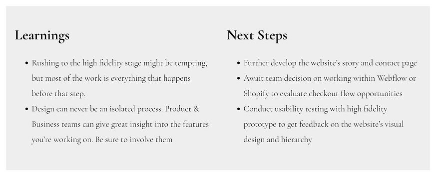
Kelly May does this well with one of her projects.

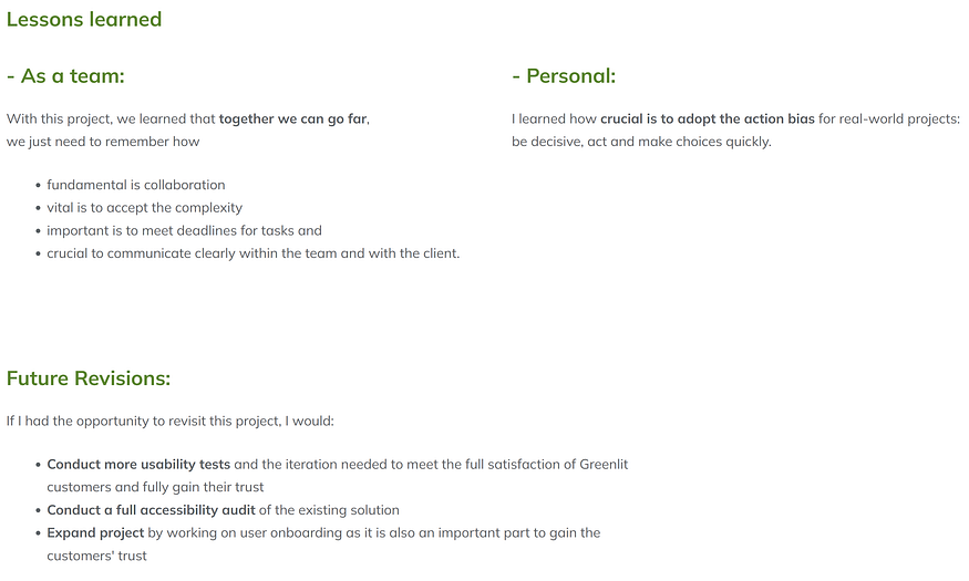
Iuliia also shares her takeaways in an easy-to-read format:

TL;DR
As you assemble your online portfolio, do the things that help recruiters and hiring managers quickly review your work. Include these critical items:
- hero image at the top with the project name and brief description
- before and after images (be sure to capture the iterations of our design work)
- takeaways (lessons learned, next steps, challenges, what you would do differently)
