Your resume needs to stand out from the other hundreds of resumes the recruiter or hiring manager is reviewing.
Using the correct format to make your experience and skills stand out is key.
Resume layout
Since you are a career changer and have recently acquired the hard skills to be a UX/UI designer, you want the most relevant information to stand out.
As a designer, you may be tempted to make your resume very ‘design-ey’. Don’t. It may impact getting through the Applicant Tracking System (ATS). ATSs do not recognize icons, graphics, or even some tables. You want to keep your resume in a simple format—one that is guaranteed to get through the ATS.
The content of a resume has a higher priority than the design of the resume.
And getting your resume through the ATS has greater importance than having a design-ey resume that looks great, but is overlooked because the content doesn’t align.
Also, studies have shown the hot spots (most looked at areas) for a resume are across the top and down the left side, with a quick glance to the right about a third of the way down the resume.
Knowing that we want to place the most critical information in those areas.
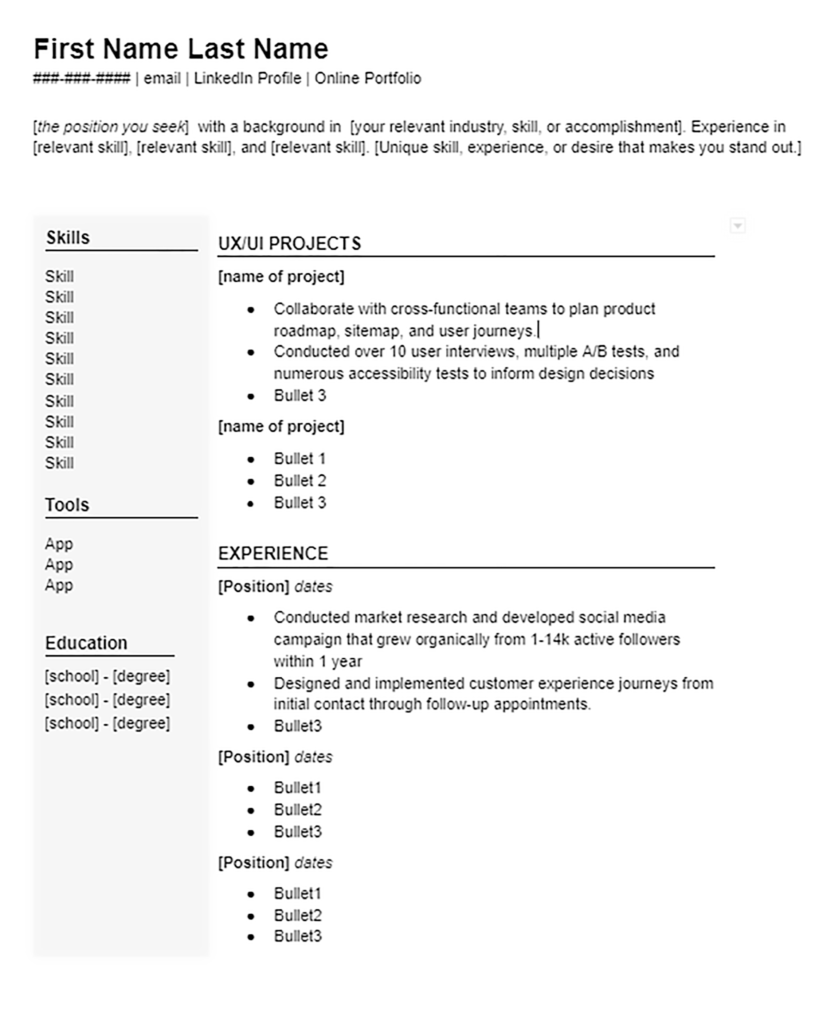
NOTE: In the two-column template below, the columns can be switched. You can place your skills/tools/education down the right side instead of the left side.
As a career changer, you likely don’t have experience in the UX/UI field. But since you recently acquired the needed skillset to be a UX/UI designer, you want to highlight that on your resume.
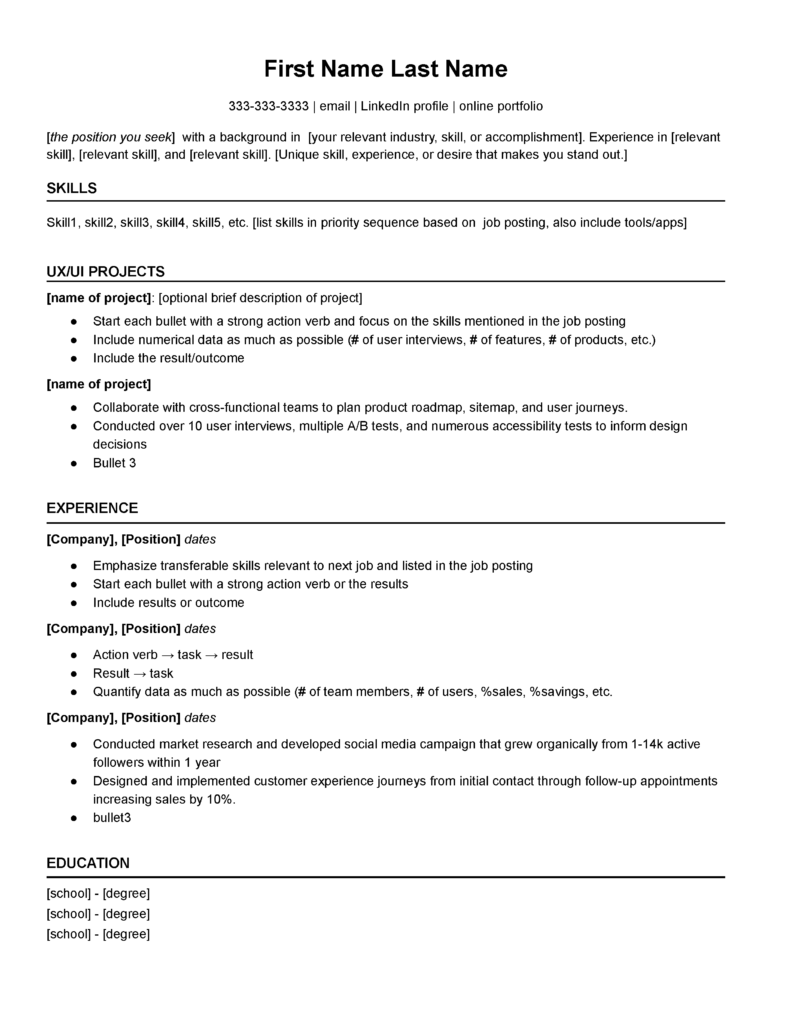
In either one of the following formats (one-column or two-column), notice how the skills and UX/UI projects are at the top of the resume.
One-column resume template

Two-column resume template

How to verify your resume is ATS-friendly
Recruiters and hiring managers are extremely busy. They use Application Tracking Systems (ATS) to help them save time.
This doesn’t mean your resume is automatically ignored if you aren’t using the ‘right’ keywords. But, it may mean your resume isn’t in the ‘potential’ pile.
This week, I want to show you four very easy steps to verify that your resume is ATS-friendly.
This is not a discussion on using the right keywords. But, it is about making sure your resume can be read by these automated systems.
Your resume must be ‘readable’
Years ago, we used to talk about character recognition when scanning a document. If your scanner software had the capability to recognize characters, then you could potentially edit the document after scanning it. (I know, I’m dating myself!)
Your resume is similar. It needs to be read by ‘machines’. These ‘machines’ simply read in your resume and places it into a digital file. Then, the recruiter can easily (by using ATS software) search the digital files and find potential candidates.
The recruiter is going to search by specific skills, location, job titles, etc.
In order for your resume to be found when the recruiter performs a search, you want to be sure your resume is read properly by the ‘machine’.
In other words, you want to be sure your resume is ATS-friendly.
Here are four easy steps to verify if your resume is ATS-friendly.
- Open your resume.
- Highlight and copy your entire resume.
- Open a simple Word Processor. (Notepad on Windows)
- Copy your resume into the Word Processor.
Can you read your resume in the Word Processor?
If so, your resume is good to go!
Instead, if your resume looks like this:
…you’ll need to redo your resume.
(I’m sorry. I know you spent a lot of time making your resume look good. But, it’s all for nothing if your resume is not ‘readable’.)
Why your resume is not ATS-friendly
If you created your resume in Figma (or a similar app) and exported it out as a PDF, your resume is likely not ATS-friendly.
I’ve heard there is a plugin for Figma that helps make it more ATS friendly (search for PDF Export plugin), but I recommend creating your resume either as a Google doc or a Word doc.
Some of my clients have had to do this and they find it is not that difficult to re-create their resume in a Google doc or a Word doc.
Simplicity vs Design-y
Keeping it simple is more important than it being ‘design-y’.
I know that’s hard to hear if you are a designer, but believe me, it’s better your content is readable vs your design-y resume never being noticed.
Use either a one-column or two-column resume. Omit icons, slider ratings, boxes, etc. Use your design skills to pay attention to the little details: alignment, consistent font sizes, use of fonts, punctuation, consistency throughout the resume, etc.
